Starting something new isn’t easy. For the 99.9% of you out there, the first time you attempt calligraphy will probably be pretty discouraging (trust me, it was for me). You might have seen some amazing videos or works from calligraphers on the Internet and wonder why yours doesn’t look like that. Honestly, it just takes TIME and PRACTICE. Once you get some basic information on how to get started, it really is just that.
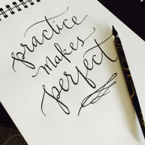
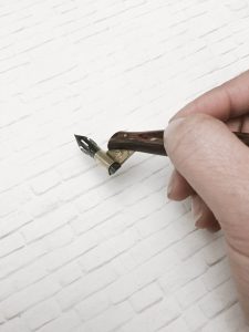
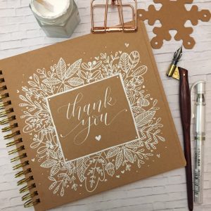
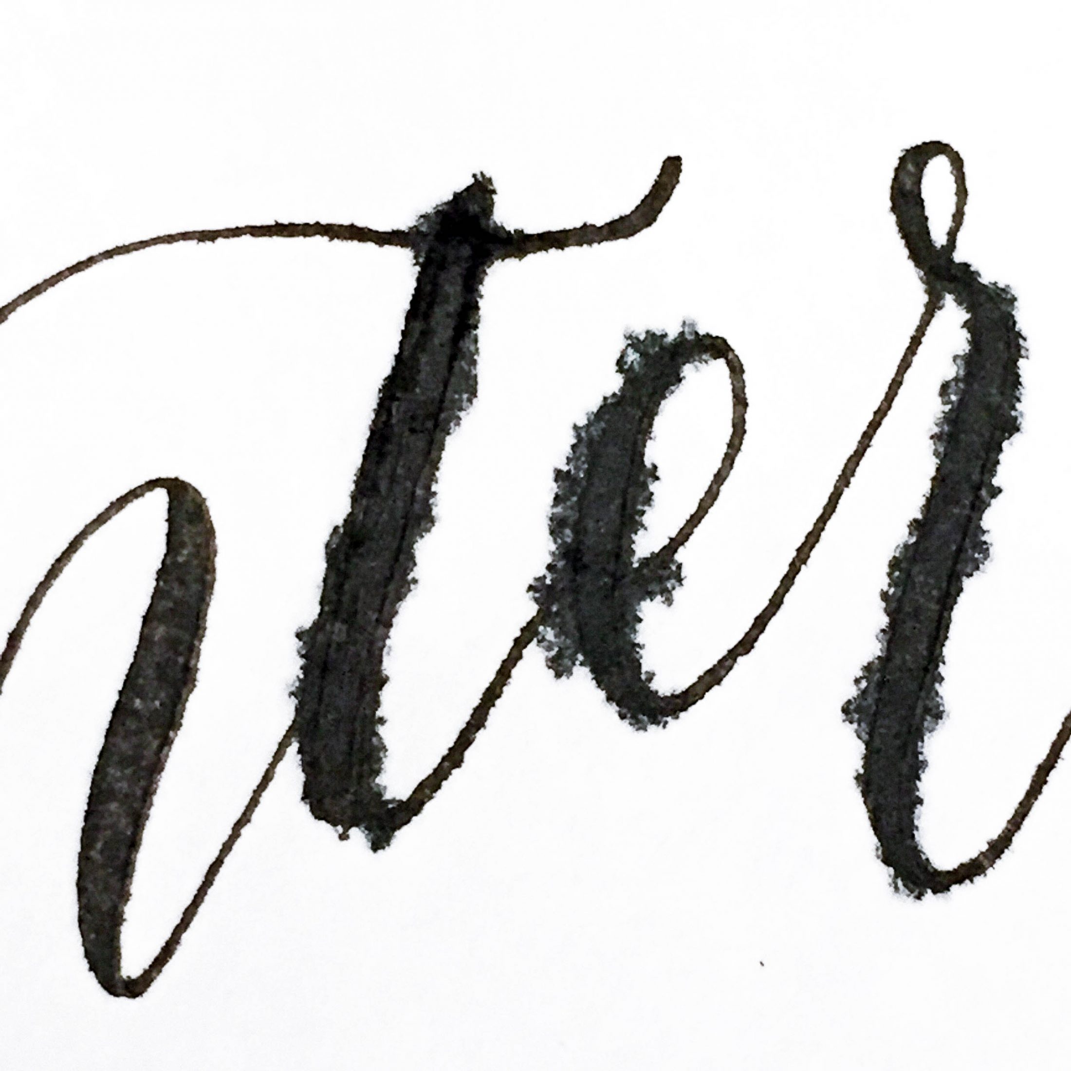
The image above is when I decided I wanted to get into modern calligraphy and what you see is my first attempt at it back in 2015. It should be proof to you that everyone starts somewhere. Every few months, I feel like my style changes a bit still. Calligraphy is an art that you can keep continuing to grow in. There are some things I wish I knew when I was getting started so hopefully the information below will help you guys!
I first got interested in calligraphy when I was planning my wedding. I saw all these beautiful paper products on Instagram and started following a couple of calligraphers from there. Inspired, I ran to my nearest arts & crafts store and bought the first calligraphy set I saw (without first doing any research). While I still love my local Michaels and Joann, I learned that the tools you need for modern calligraphy are mostly available though specialty retailers like JohnNealBooks or PaperInkArts (and Amazon on occasion).
The supplies I bought didn’t give me the graceful lines that I saw most modern calligraphers could achieve. I wondered why I wasn’t getting the really fine lines and thicker swells. I kept wondering what I was doing wrong for a long time until I realized it was the materials I was working with! So to save you all the time, research, and trial & error, I’ve compiled a list of MY favorite tools to help you get started.
Here are some of the basic supplies you need to get started:
- Nibs
- Nib holder
- Ink
- Paper
- Ink containers
Nibs
The difference between what you find at local art stores like Michaels and Joann’s are that they sell italic nibs (typically by Speedball) which are designed for Old English type font but won’t have the flexibility in their tips to get those thin and thick strokes that are characteristic of pointed pen calligraphy.The italic nibs have a flat and rigid tip which creates only one size of stroke, whereas the pointed pen nibs have a pointed tip that can open when pressure is applied. Italic nibs are fun for writing in a different style of calligraphy like an Old English or Gothic style, but not able to write in the modern script that is so popular now.
Italic nibs: broad tip nibs not used for modern calligraphy script
The pointed pen nibs, in contrast, have a fine point tip. If you notice, there is a slit from the tip of the nib down to the hole in the center of the nib. This allows it flexibility so that when you write, it open and closes depending on how much pressure you are applying.
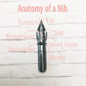
Anatomy of a Nib
In a pointed pen nib, the tip meets at a very fine tip. There is two tines that separate at the slit when you apply pressure downward. The vent hole, also known as the reservoir, is where the majority of ink is stored. Therefore, the nib should be dipped past the reservoir in order to properly load the nib with ink. The shoulders of the nib provide rigidity and structure. The body of the nib is the stiff portion where the nib fits into a nib holder. The body of the nib is also where the nib ID is. The nib ID will have the name of the manufacturer and number so you can identify the type of nib.
The nib that I started off with was the Zebra G. It is traditionally considered a drawing nib and not a calligraphy nib but I find that it works well for a modern script. The Zebra G is a fairly stiff nib so it does not work as well for more traditional scripts such as copperplate script but it works well for beginners trying to get the hang of calligraphy.
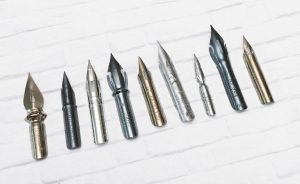
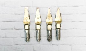
Nibs from left to right: Leonardt 41, Gillott 404, Zebra G, Leonardt (Hiro) 40, Hunt 22, Brause 76 (Rose), Brause 66EF, Brause 361, Leonardt Principal EF
My current favorite nib is the Hiro 40 (also known as the Leonardt 40) Blue Pumpkin nib because its still fairly stiff but a little more flexible than the Zebra G. Because it is a stiff nib, it is easier to control than a nib with a very flexible tip. It still will allow you to get a good difference in stroke size between upstrokes and downstrokes so you can still get fine hairlines and decent swell lines. The Zebra G is also fairly easy to find online. There are many nibs out there and each type of nib will vary in qualities like stiffness, ability to hold ink, how fine the points are, etc. I recommend trying out stiffer nibs for beginners since it requires the least amount of hand control. As your muscle memory for writing improves, it becomes easier for you to maintain even pressure and it will be easier to use more flexible nibs.
Another important note about nibs is that new nibs have to be properly prepped before they can be used. New nibs have an oily industrial coating from the manufacturing process that is water resistant. Since most inks are water-based, it is difficult for ink to adhere until the coating is properly removed. Without prepping, there will be problems with ink flow and ink will tend to bead on the nib instead of evenly coating it. There are two easy household solutions for prepping your nibs. You can either use rubbing alcohol or Windex window cleaner and a paper towel to rub down the nibs. Vigorously rub down the nib and then rinse off with water. Then dip your nib into your ink and see how evenly your nibs is coated in the ink. If the ink beads, then repeat the process until the nib is evenly coated with ink.
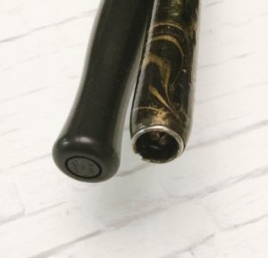
Nib Holders
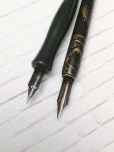
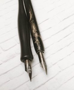
I started with a regular straight nib holder until a friend introduced me to obliques. Straight holders are more readily available in stores and tend to be less expensive than obliques. These pens have an opening that will allow the nib to attach straight on. There are two different types of way nibs attach to the tip. Both obliques pictured below are by Speedball. The one on the left is a plastic holder that has a circular indentation where the nibs would fit. This limits the size and shape of nibs that can fit. I’ve mostly only used my Zebra G with this nib holder. The straight holder on the right has a universal insert, which can fit more varieties of nibs. These types of nib holders most resembles a regular pen so holding it feels very familiar.
However, obliques were designed to help calligraphers achieve a right slant to their lettering with more ease. An oblique looks like straight holder but has a flange at the end which holds the nib at an angle. The oblique angles the nib so that the nib tips drags less on paper. It is important to note that not all nibs will fit any nib holder. JohnNealBooks has a really wide range of obliques and has a good resource which offers a list of nibs that fit their obliques.
My first oblique was the Speedball Oblique pen holder, which is an affordable option. The limitations with the Speedball oblique is that it has a plastic flange that fits a very limited number of nibs and does not allow you to adjust the depth in which you can fit the nib.
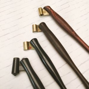
From left to right: Speedball oblique, John Neal Books H96 Adjustable Oblique, Paper Ink Arts Wood Turned Oblique, Paper Ink Arts Hourglass Adjustable Oblique
My favorite affordable wooden oblique with a metal flange is Paper and Ink Arts’ Turned Wood Oblique Holder. The wooden holder has a bit more weight and thicker size than the Speedball, which is more comfortable when writing for longer periods.
The most versatile oblique, in my opinion, is the Paper and Ink Arts’ Hourglass Adjustable Oblique. While a little pricier, it has an adjustable flange that fits a wide range of nibs. I haven’t had a nib that hasn’t fit it yet. The flange has a screw that can be loosened and tightened to fit different nibs.
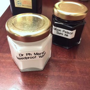
Inks
Black Ink
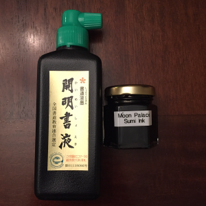
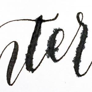
I first tried Higgins India Ink and Speedball black ink but I find that the consistency of ink is a little watery and I prefer my ink very dark and opaque. I’ve also found that more watery consistency inks tend to bleed more on a greater variety of papers.
Then I discovered sumi ink. Its easy to use, works on a lot of paper types without bleeding, has a glossy, raised and almost embossed-like finish. Sumi ink is a vegetable based ink and has an earthy smell to it. Its available in stick form and in liquid form, but the liquid form is much more convenient to use for calligraphy purposes. The ink dries very black and has a shellac-like sheen to it when dried.
White Ink
There’s no better white ink (for me at least!) than PH Martin’s Bleed Proof White.
It takes some getting used to because it doesn’t flow as easily as the Sumi ink but it looks great on colored card stock. When you first get it, it needs to be diluted with some water. The ink feels like almost a thick paste straight from the jar. I use a teaspoon dropper and put a little at a time and test its consistency. Remember if you put too much water, you can always evaporate it out by leaving your ink uncapped overnight. I add a few drops at a time until I get a nice even coat on my nibs and good flow while writing. The more watery the ink is, the easier it may be to write with, but you will lose some of the opacity that comes from it. If this happens, you may have to evaporate some excess water. But, as the name suggests, I haven’t had an issue with this ink bleeding on most types of papers.
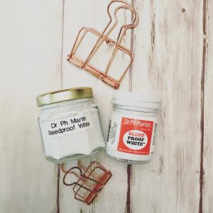
Bleed Proof white also has to be continually mixed before and during use because the pigment settles to the bottom. I keep a couple of pronged toothpicks to stir the pot.
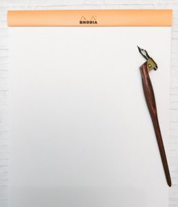
Paper
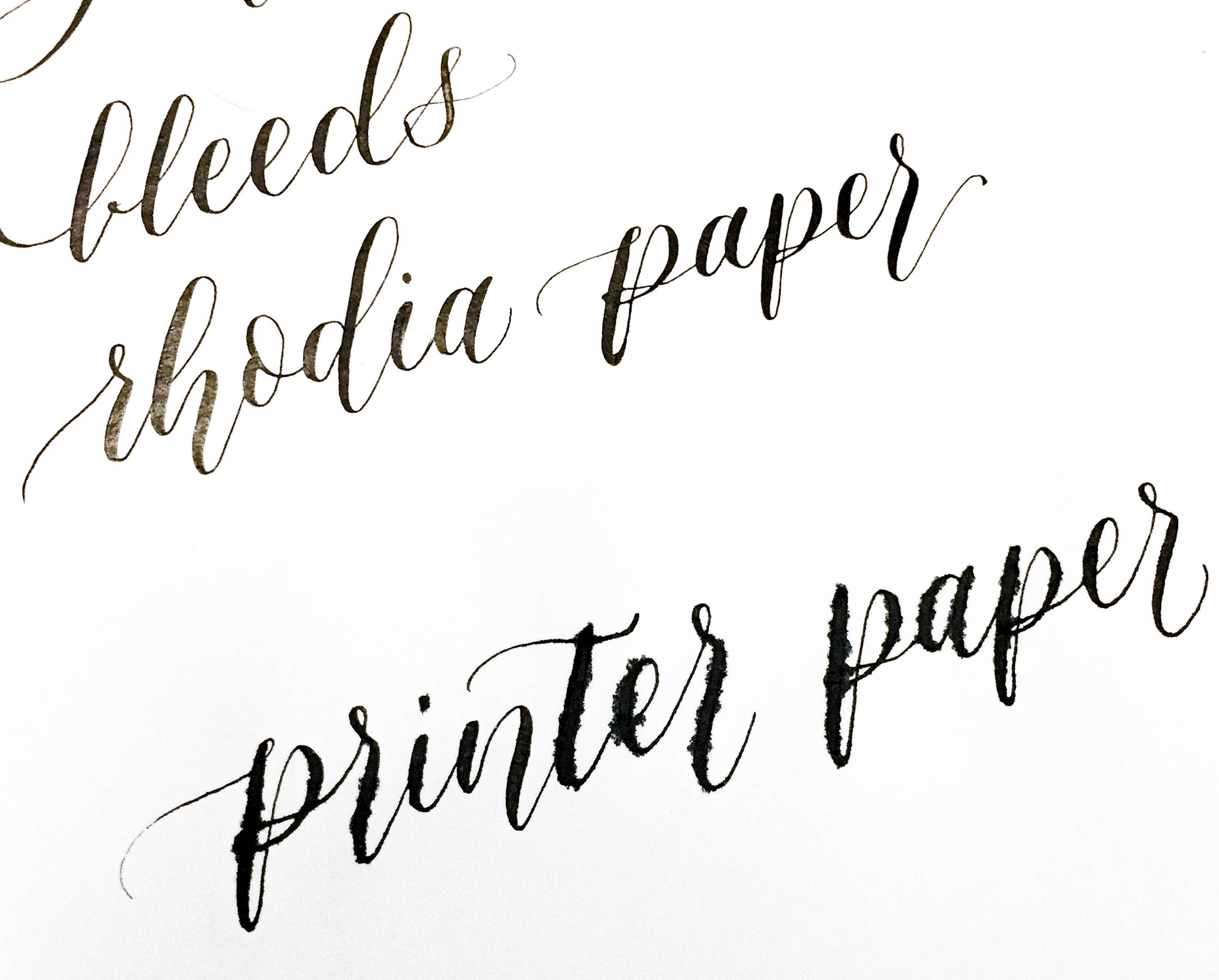
Choice of paper, I’ve come to learn, is SUPER important in calligraphy. Even, and especially, when you are first starting and just practicing. Buying the wrong paper when you’re first starting can be discouraging if you’re seen bleeds everywhere. I initially started with any white paper I had lying around which was normal printer paper. What I found was that my printer paper was too thin and porous to hold calligraphy ink. Porous paper is what causes bleeds and feathering when you letter. The more porous the paper, the more ink will just bleed when it touches the paper.
-
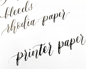
- Rhodia paper vs printer paper
-
- Regular printer apper
-

- Rhodia paper
There are some printer papers, such as HP Premium Choice Laserjet Paper 32 lb that is an excellent option for beginners and for practicing. The higher the pounds of the paper suggests that it is a thicker and most likely a higher quality paper.
My favorite paper to use are in the Rhodia pads. Rhodia pads come in a few varieties of blank, line, graph, or dot paper. All the paper is extremely smooth which will preserve the life of your nibs and pens. Rhodia is a French brand of artistic paper pads. I prefer to use Rhodia dot paper for practicing since the dots help guide me to write straighter but I use the Rhodia blank white paper when I want to digitize my work so that the dots are eliminated from my images.
Ink Containers
You need a fairly small jar to fill with ink so that you can dip your pen nibs in. I’ve seen people buy these little jars that are specifically made for calligraphy but I’ve also seen people use baby food jars. I found these cute 1.5 oz hex jars from Amazon and bought them in bulk since I wanted to mix a lot of my own inks.
Tiny jars like these can be found a lot of places if you just want to start with a couple. Crafts stores like Michaels or Hobby Lobby should have these type of jars (sometimes in their wedding favors section). Just make sure that the jars are waterproof, meaning they won’t leak when knocked over to the side. This will prevent accidental spills and also unwanted evaporation. Most jars intended for sealing foods will work perfectly fine.
Ready to get started?
This is just what I recommend for beginners. Many calligraphers will their own list of personal favorites and there is no real consensus now which products are the best. These are some supplies that I have personally used and would recommend to others. I would encourage you to buy a few supplies, enough just to get you started and find out if this is a hobby you are passionate about. If you are, grow your collection. You will find that calligraphy can be a very expensive art but it doesn’t have to be. I encourage you to try things out for yourself and find what works best for you.
Hope this helps! If you have any questions or comments, I’d love to hear from you!
1 Comment
I have been wanting to try calligraphy for over 30 years but never know how to begin. I think I’ll keep following you and actually give it a go.